Considering how happy and engaged I feel when I’m creating art, I decided to dedicate an entire month to it. During it I am forbidden from doing anything that doesn’t make me feel good, to the best of my ability.
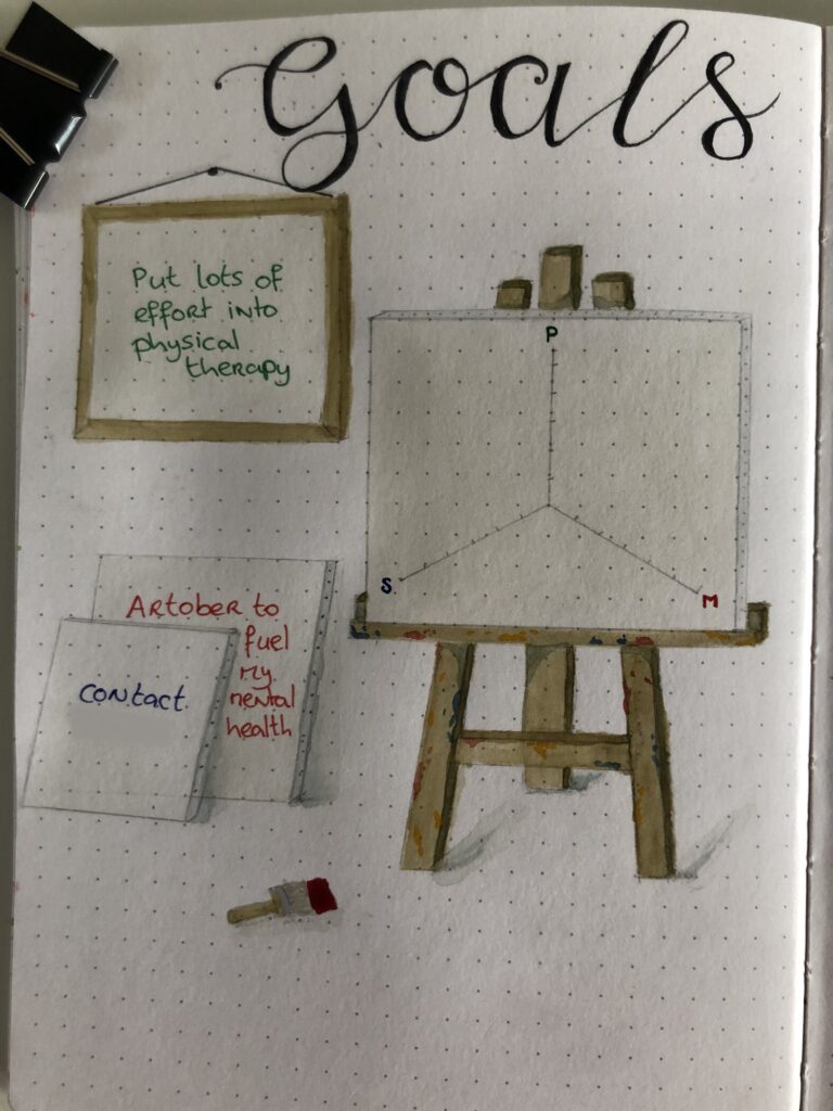
This overarching goal is reflected in the goals that are stated in my journal. I do not enjoy going to the gym and have ‘failed’ myself almost every month with that goal, so out the window it’s gone. My physical therapist has agreed to pick up the slack and see me twice a week instead, to work exactly the muscles that need improving.
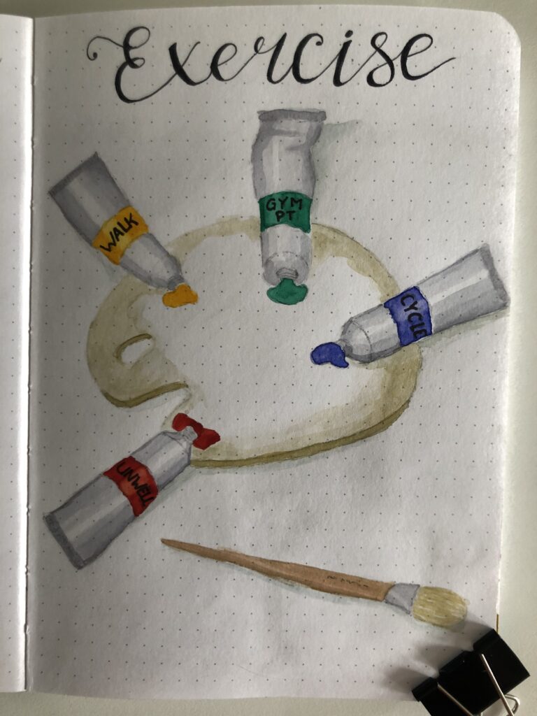
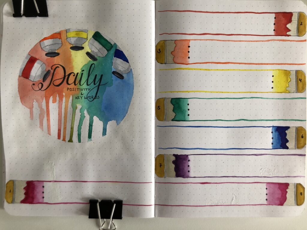
Since I do still have a gym subscription I figured I’d add it to my exercise page, but only coupled with ‘PT’, because trust me when I say that my physical therapist knows how to make me break out a sweat! The idea with this page is that every day I add a little bit of paint in the appropriate colour, just to note what I did to exercise my body that day. At the end of the month, I’ll hopefully have a beautiful overview of which colour dominates my palette!
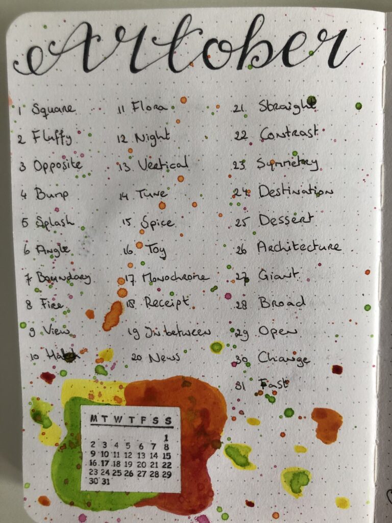
‘Artober’ is a play on the well established social media trend of ‘Inktober‘, in which a new piece of art is made with pen and ink each day of the month. Unfortunately what could have been a great way to unite and empower artists became tainted and problematic which made me want to stay as far from that particular bandwagon as I possibly could.
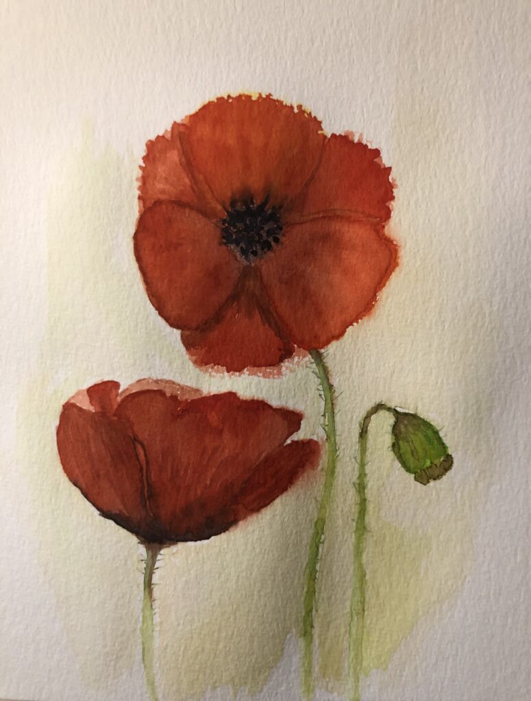
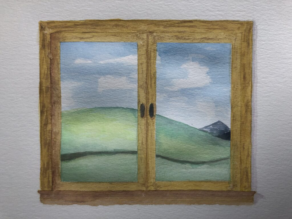
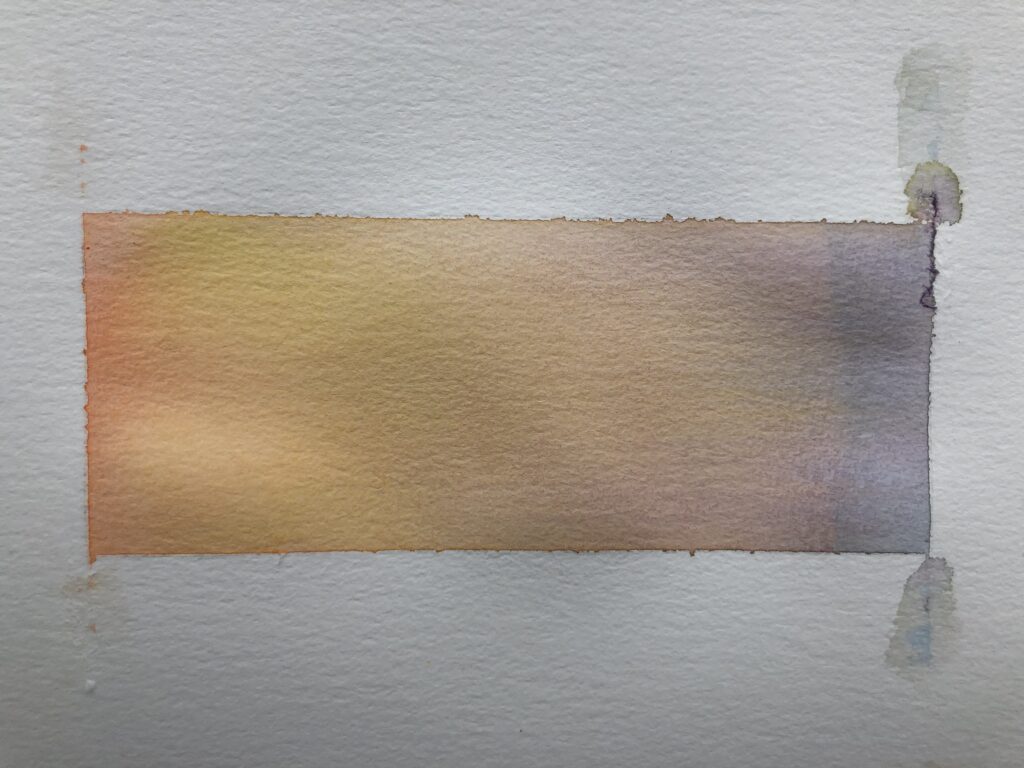
I looked up some alternative prompts online and bought myself a brand new watercolour notebook to paint in. It has 30 pages, so I get one wildcard, just in case I’m miserable, uninspired, sick, or otherwise unable to create a little artwork. This website has actually been relaunched for the specific purpose of being able to share my art throughout the month, so make sure to keep an eye on my progress!
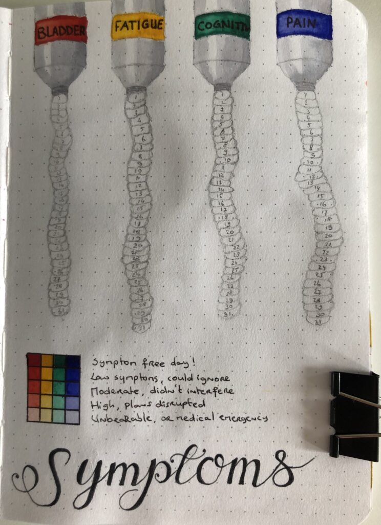
I have probably created the single most useless symptoms tracker I could come up with this month, since it’s so unlikely that I’ll get the shades just right to indicate all the fine nuances I like to track. It does look cute though and I’m particularly happy with how the light on the tubes came out! And as William Shakespear once wrote in ‘King Lear’:
Striving to better, oft we mar what’s well.
William Shakespeare, 1606
Or, in other words: “perfection is the enemy of good”.
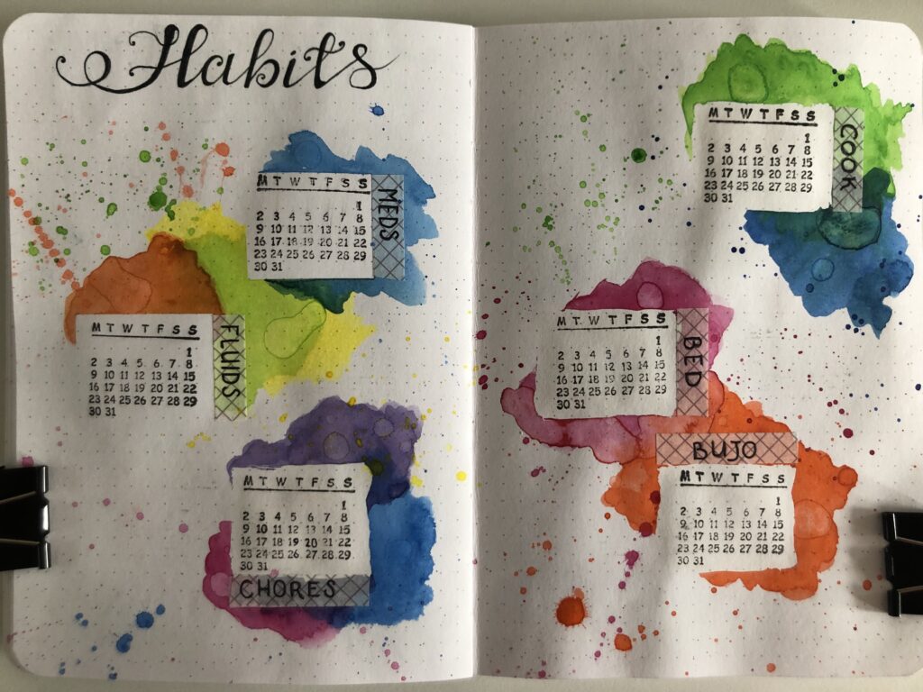
I bought stamps to create quick and easy calendars and while they are a bit finicky to use without smudging or missing parts, it saves me loads of time! I used masking tape for the first two areas, but switched to masking fluid for the rest because it gave a more organic look and also wasn’t as harsh on the paper.
Speaking of which, I can now safely confirm that this journal is able to deal really well with watercolour paint! Obviously it’s nothing like using actual fancy paper made of 100% cold pressed cotton, but I think it came out looking pretty cute and there is literally zero bleed through to the back of the page. Win!
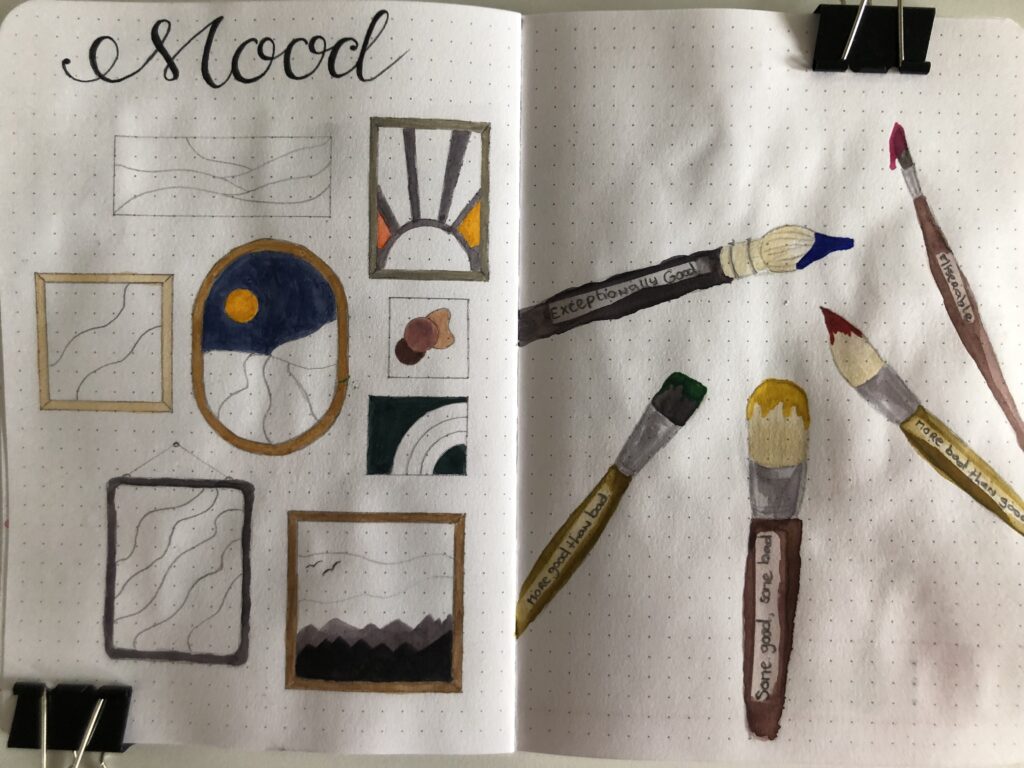
I am so excited for tracking my mood this month! I’m really looking forward to seeing the art pieces take shape as I fill them in with the assigned colours. To avoid it becoming too monotome I decided not to number the areas and to use variations in intensity of pigment to allow some diversity in how the end result will come out looking.
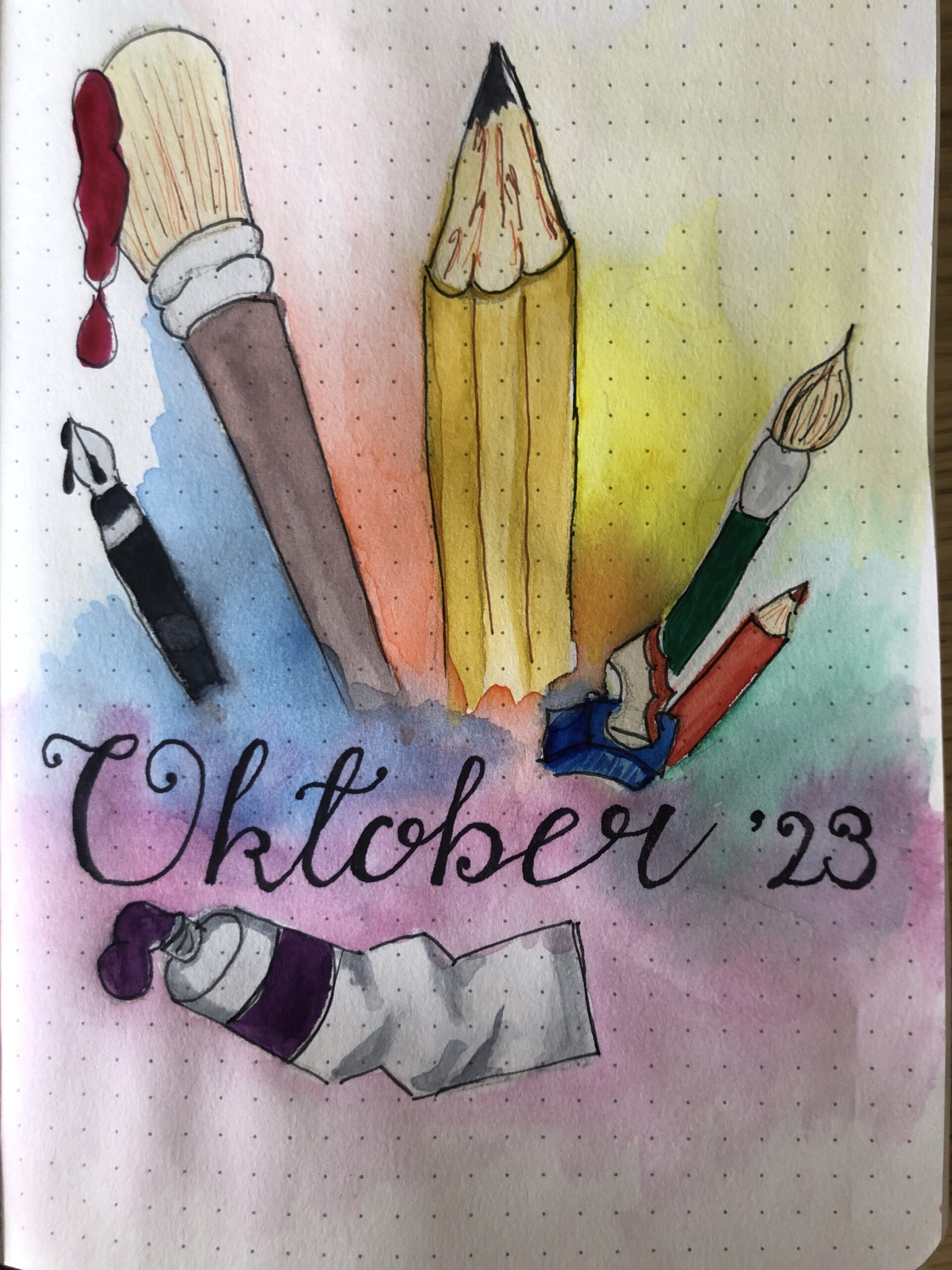
A month that starts on a Sunday poses the unique problem of “what to do with all that free space on the page”. I think I found a pretty unique and creative way to frame the title to solve that issue.
Speaking of titles, I absolutely hate hand lettering because I can never get it to come out looking ‘nice enough’. Can I point you once more to the quote that I picked this month? Thanks Mr. Shakespeare, you are absolutely right and nobody cares that I created this month’s titles by using an online cursive generator for an example to copy! I think I did a good job, William can be proud of me.