After putting a lot of time, effort and creativity into July’s field journal theme, I wanted to do something a little less labour intensive for August. While I love how this black, white and gold theme came out in the end, I still had to put in a lot more work than I thought!
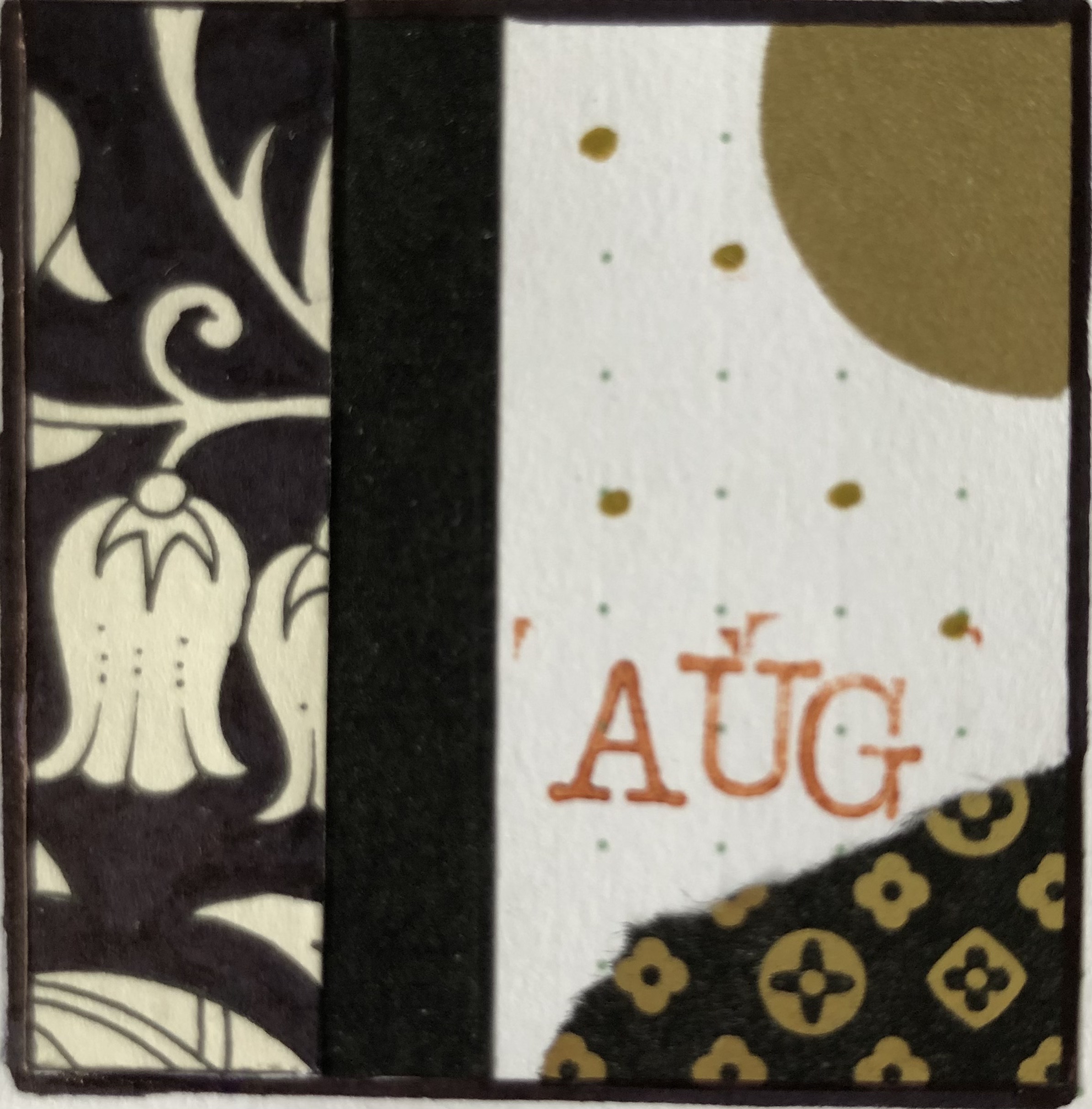
For decoration this month I cut up a couple of pages from a colouring book I was gifted a while ago. Johanna Basford’s ‘Enchanted Forest‘ is an inky wonderland with leafy motifs and curious creatures hiding amongst the branches.
Adding to that I used some leaf stamps and completed the look with gold tapes and large confetti’s, accentuated with a gold marker.
You can do anything, but not everything
This month’s quote is attributed to David Allen, an author and so-called productivity consultant. While I don’t follow his methods, I did find this phrase inspiring. I tend to bite off more than I can chew in terms of things I get excited about, so this will remind me to prioritise.
I’ve been really enjoying my weeklies mixed in with my trackers. Having to flip through all the pages of my theme every day allows me to enjoy the decorations throughout the whole month, so I’ve decided to stick with that this month as well. On the left hand pages are my weeklies, while all my trackers are included on the right.
I really enjoy circular trackers, but I am not going to attempt making any, especially for a 31 day month, ha! This one I printed from 101planners.com, a website that offers an editor to easily create fun spreads with low effort.
I struggled with my exercise page. At first I tried using a marker, then went over that with gold paint and eventually hid all those attempts with tape for the tracker. I do really like how the white lettering on the black tape looks for the categories, so in the end it all worked out after all.
It’s a little hard to see on these pictures, but each page is cut into tabs for easy navigation, then decorated again with some portions of colouring page. I promise it looks pretty good in reality ha!
The shimmery gold tape that I used to accentuate the tabs’ backdrop does not scan well at all. It looks straight up dotted here, but in reality it’s a really subtle effect that works well with the overall theme.
Creating these large black surfaces was a pain in my butt. While I used a marker to colour in the smaller decorations, I used paint (gouache) to do these large ones. Getting them to be fully opaque as well as getting every little nook and cranny neatly filled in turned out to be a multi-day endevour. It was hell on my neck and shoulders, but the results look stunning, if I do say so myself.