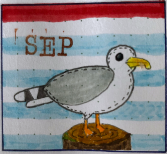
I’ve always been drawn to the colour scheme of bright red, dark blue and pastel blue, for a nautical children’s room. So when I saw a cute illustration in that style, it inspired me to create this theme in my journal.
I’ve started collecting Ecoline brush pens and this theme offered a great opportunity for using them. Their colours are vivid and the paper handles them well. I used the numbers 334, 508 and 580 and added some matching inks and washi tapes to complete my pallette.
The lighthouse accidentally had exactly the right amount of stripes to fit the entire word ‘September’ in, I actually didn’t plan that. I’m excited about how well that worked out!
Just as in the last few months, I’ve continued my style of combining the dailies with trackers so that I get to flip through and enjoy my art every day of the month.
September 2024 starts on a Sunday and ends on a Monday, which posed a challenge on how to arrange my dailies. Instead of trying to give each week its own spread, resulting in two weeks with a single day in it, I chose to let go of the weekly structure and just create a continuous flow of days.
While my ‘mood-whale’ came out looking incredibly cute, I do think its eye positioning is giving him a concerned expression. Maybe it’s because it isn’t used to being on a page without water… 🤔
I mixed watercolour paints to use on the whale. It was surprisingly challenging to get just the right shades, but I think I managed very well! The legend above my symptoms tracker will be used for the mood tracker as well. The greener the water, the worse it is. That’s how that works, right?
The rope across both pages was a last minute addition to this spread. Having only the anchor there felt a bit lackluster, so I think the rope really helped tying it all together. See what I did there? 🤡
Thanks for reading and looking at my journal theme. Please leave a comment below to let me know what you think!