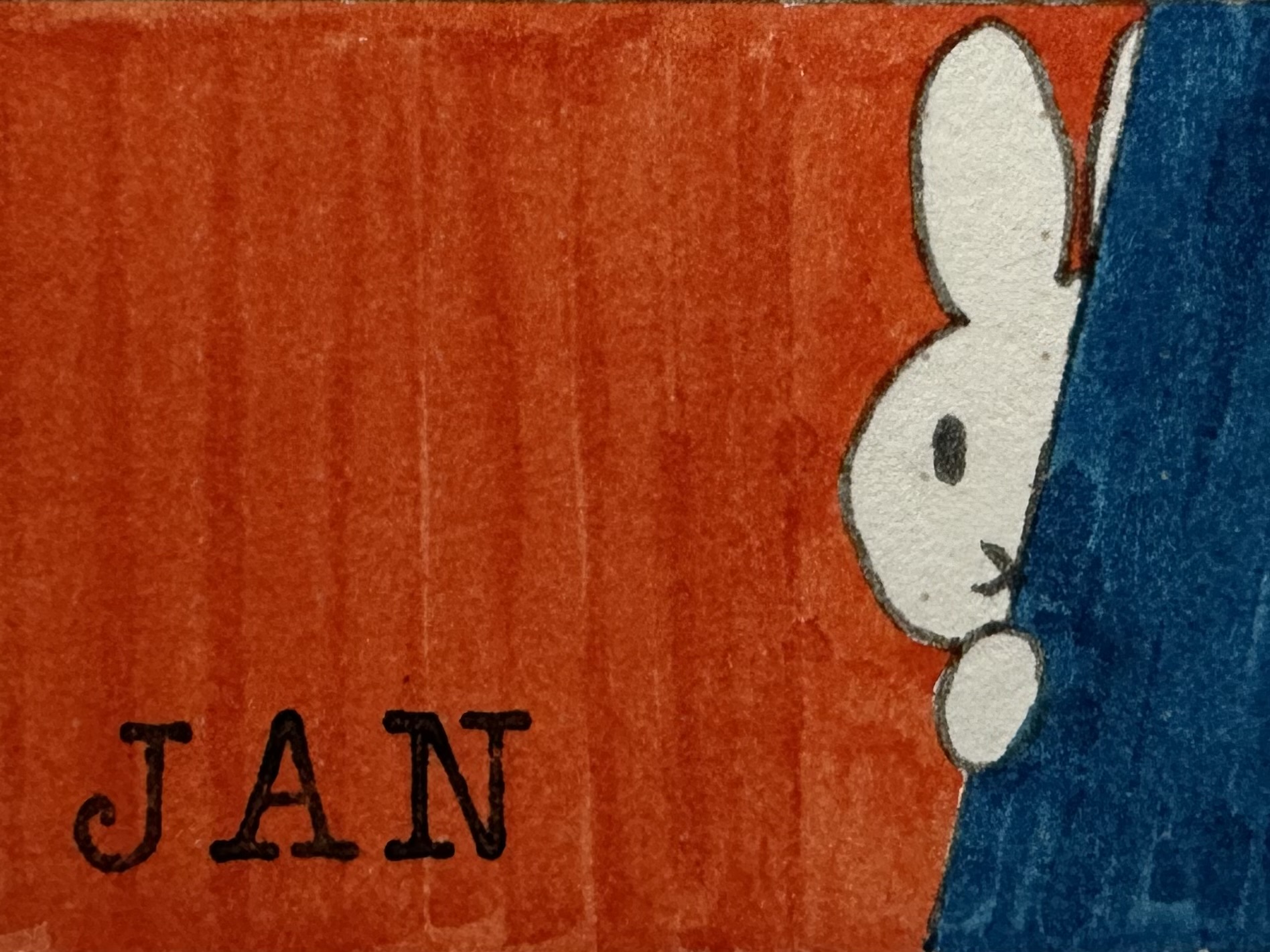
New year, new journal, new theme! As I wrote in the post about my journal for the first half of this year, I will be creating themes within an overarching theme. They will be based around children’s books, especially those that are meaningful to me.
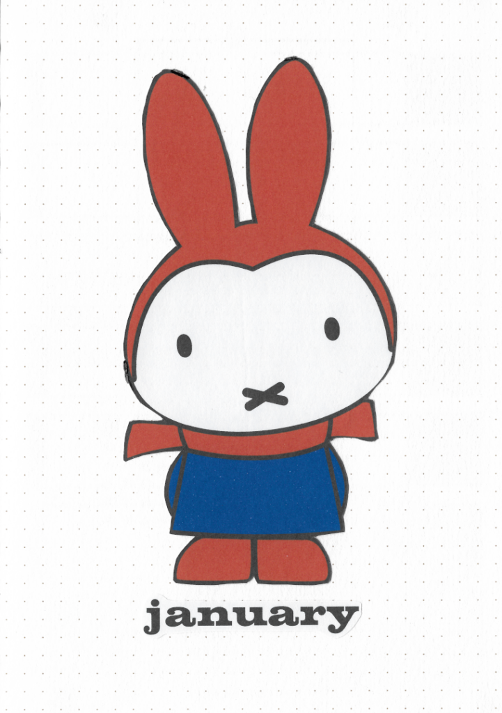
The first theme of the journal will be Miffy, or ‘Nijntje’ as she is originally called in Dutch. I don’t know if this is a universal truth, but from my perspective everyone grew up on stories about this little bunny, illustrated with simple brightly coloured graphics made by Dick Bruna. I certainly hold very fond memories involving these books and so she gets to be my first muse of the year.
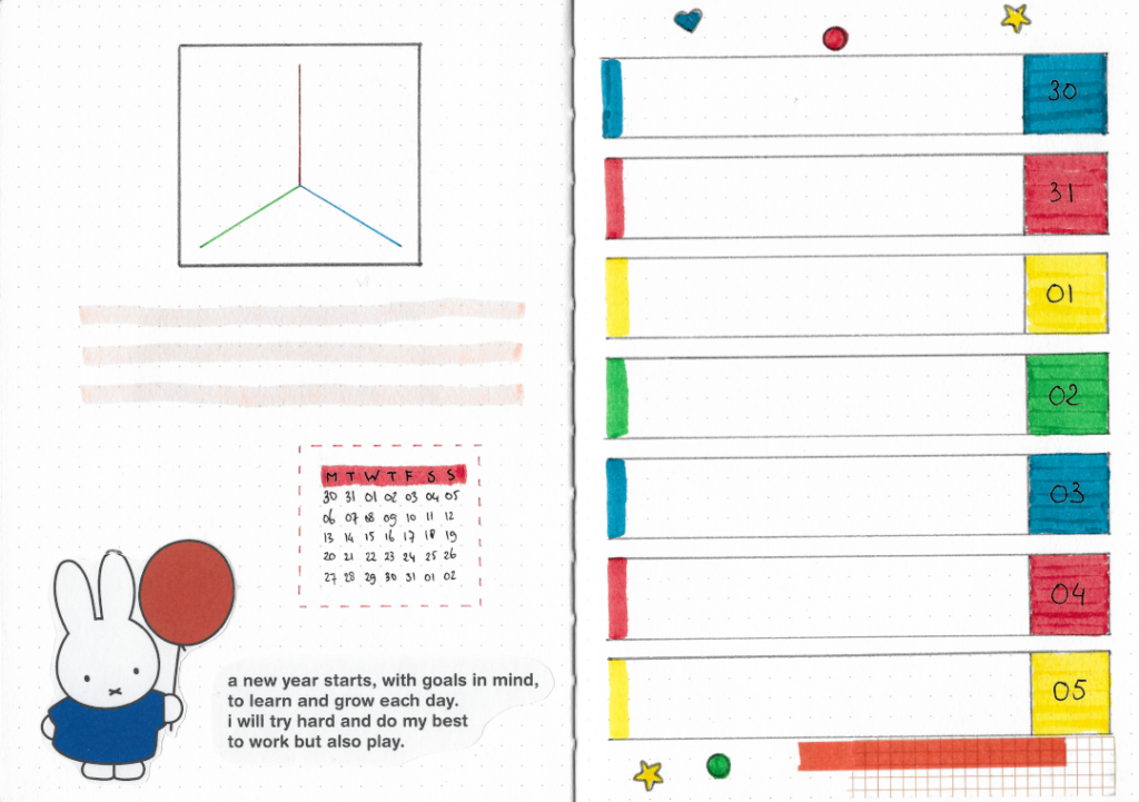
Unfortunately I have found many flaws in my execution of the theme, not in the least that I decided to create stickers instead of just sketching and painting the drawings myself. This journal’s paper is not bright white and so the stickers stand out a lot.
On the plus side, I was able to recreate the titles and text in the appropriate fonts that are close to what is used in the books, Volta and Helvetica rounded.
a new year starts, with goals in mind,
to learn and grow each day.
i will try hard and do my best
to work but also play.
Most of Dick Bruna’s children’s books have four lines of text on every other page. The last word of the second line rhymes with the last word of the fourth line. I did break that rule, but I’m still quite proud of my own little rhyme in the spirit of starting a new year.
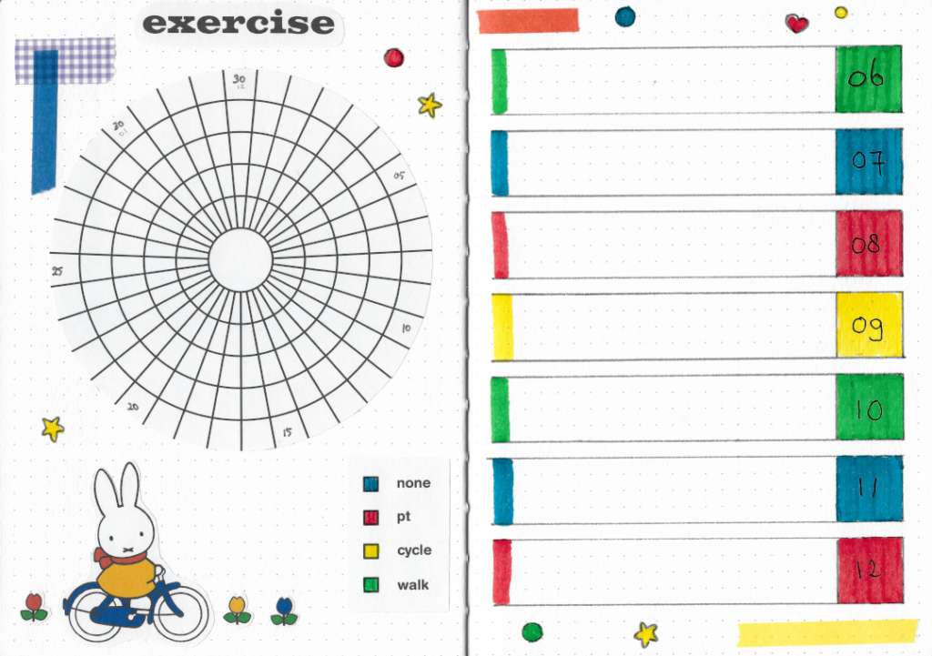
Dick Bruna used only a limited range of colours: red, yellow, blue, green and black. He occasionally used brown and grey, and used orange even more rarely. You are unlikely to find purple in his books, because Dick didn’t like purple! Because he liked his red to be warmer than the standard red, he mixed in some orange. And he didn’t want his yellow to be too cold, so he mixed in some red to make it warmer.
I managed to get my colours pretty accurate, but unfortunately scanning the pages has taken all of the nuances out of the carefully selected colours. You’ll just have to take my word for it!
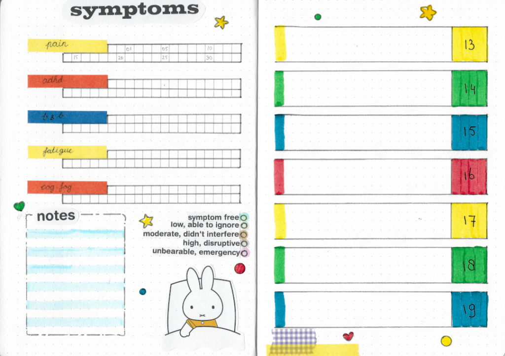
I included a small area to write some notes on my symptoms page this month, because I’ll be getting an my half-yearly IV with medication. It has the potential to leave me feeling different symptoms than my normal ones, so I wanted to include a space to record those. Hopefully that space stays (mostly) empty!
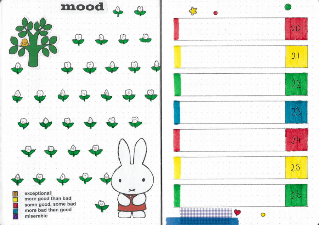
My mood tracker sadly displays another few mistakes I made this month. Not only have I cut some of the stickers much too close to the image, but I also started numbering these little flowers at 1 instead of 30. I’ve included my mistakes because they’re real and we see plenty of perfect journals on social media already. It also saves me time editing, ha!
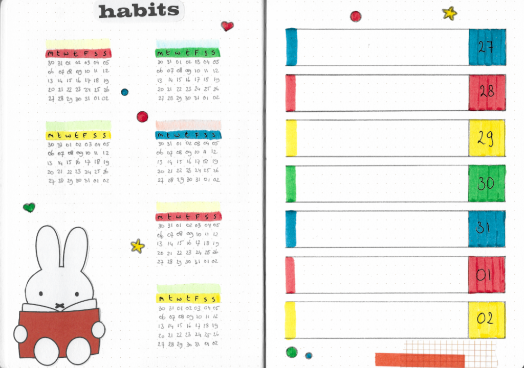
I was admittedly a tiny bit worried about going back to an A5 journal again after getting used to a B5 one, but I’m not disappointed so far! Aside from the mistakes that I pointed out, I’m actually quite pleased with how this first theme came together.
Thanks for looking, I’d love to read what you think in a comment below!
