When I started journaling I bought a very cheap dotted journal to see whether I’d enjoy the habit and whether I’d keep up with it. After a few months of finding not only enjoyment but also usefulness in keeping a record of my life in a way that nourished my creative soul, I decided to buy a new one that allowed for a better watercolour painting experience.
While this provided a much nicer medium, I ultimately wasn’t a fan of the bland paperback cover and the limitations that I faced with A5 sized pages. So to start 2024 off with a bang (and to reinvigorate the habit after taking a break from it), I decided to get yet another one.
I chose a handbound B5 sized journal by Paper24, which has 160 pages of 160 GSM dotted paper. While this journal has a lower paper weight than the previous one, I’ve found that I can still paint in it somewhat comfortably. If the need arises I could always use the paper from my previous journal and paste the painting into this one.
At almost €35 it was a lot more expensive than either of the previous two journals, but the increased size has been a great benefit when planning out my spreads, which justifies the price to me.
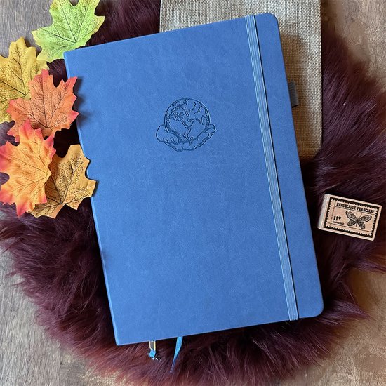
It has a really nice hard cover, bound in faux leather and embossed with a pretty graphic that someone close to me called a meatball (it’s a globe, thank-you-very-much!). The pages are a fancy silver on the sides and lay open flat, which makes photographing them quite easy.
There are two bookmark ribbons, with one having a little charm of the brand’s logo on it that I promptly removed. On the inside of the back cover is a little pocket that contains a complimentary calendar and a writing test page, so that was a nice bonus.
As long as I’ve been journaling, I’ve wanted to create a scrapbooking theme with brown paper. So for these new yearly pages in this brand new journal I decided to finally go ahead with that.
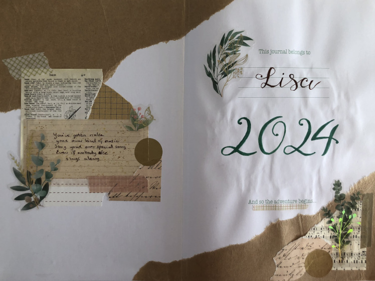
You’ve got to make your own kind of music, sing your own special song. Even if nobody else sings along.
Barry Mann & Cynthia Weil for Mama Cass Eliot
Throughout my life I’ve lived by the principle of working hard to create opportunities for myself and of dancing to my own tune. So when I looked for a quote to inspire me this year, this song lyric was an obvious choice. I thought it was a nice touch to pick the part of the (fake) dictionary page that includes the entries for several musical instruments for this collage.
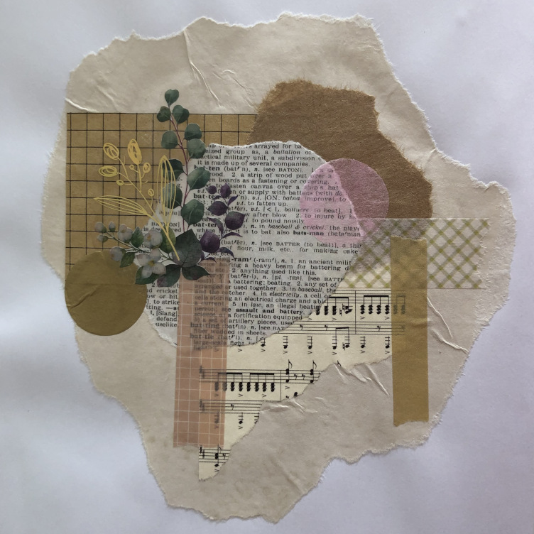
Creating these collages was a lot of fun! It took a few pages to figure out that the pvc stickers of plants, with gold details, actually had a sticky side and didn’t need to be pasted down. This one is on the left hand page next to my yearly calendar.
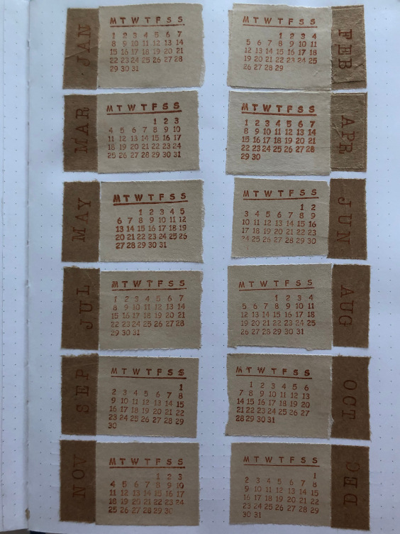
That calendar gave me a little grief, or rather my brain did. Before sticking each month down I found out that I had made a mistake with a couple of them, so thankfully I was able to replace them before they were pasted down. Unfortunately my brain was not done farting all over itself yet, so I ended up with a 30-day Februari and Gods know what else I messed up. It’s been a while, but as you can see I had to redo both Februari and April after they had been stuck down. I’m still happy with the result, I find it kind of charming to see the mistake.
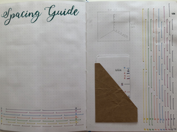
I’ve loved having a spacing guide, so I was happy to recreate that again in this new journal. I’ve left the blank space to the left intentionally empty, just in case I find throughout the year that I run into something else that could do with standardisation, that I could add there.
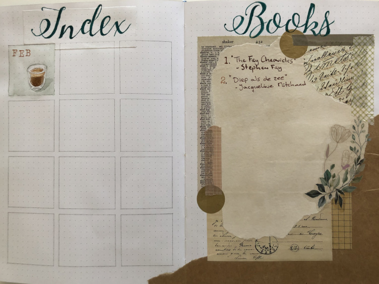
A mistake I wasn’t very happy with was made on the brand new ‘Index’ page I decided to add this time. I tried using (what I thought was) graphite paper to transfer a print of the pretty font I chose. Unfortunately I messed up and the paper shifted while transferring, so it was all crooked on the page. “No problem,” I thought, “I’ll just erase it and start over.” To my horror I found that it was actually not graphite at all and that I wasn’t able to correct my mistake with an eraser.
Since I had already been using my journal while I finished up the titles on my yearly pages, there was no option to glue pages together or some other way of starting over. And since this page is meant to hold little watercolour paintings to show the themes for each month I also couldn’t use white-out or anything like that. I ended up deciding to create a patch to cover the ruined area out of the same paper cut from the last page.
It’s a bummer and I immediately threw out the faulty tracing paper, but it’s the best option out of a lot of bad ones. Overall I think it looks okay, but I’ll never try using tracing paper again. Lesson learned!
One thing I haven’t addressed yet is the beige coloured paper I used in these spreads. It’s actually just printer paper that I coloured a wile ago with tea and coffee to achieve a dated look. I really like how it looks with the brown kraft paper. The other components are all standard decorations I bought online for this theme, with the exception of the big gold dots – those are actually confetti’s that I found in a local store. I have so many of them, in so many colours, maybe I should do a dot theme some day!