The summer officially starts in June. Temperatures start going up, I replace my winter wardrobe with summer clothing and I have my backdoor almost permanently cracked open, much to the delight of my pets.
During these warm summer days there are few things more refreshing than a big pitcher of water with slices of orange, lemon, lime or grapefruit in it, alongside a hefty serving of ice cubes. That’s why I was inspired to make it this month’s theme.

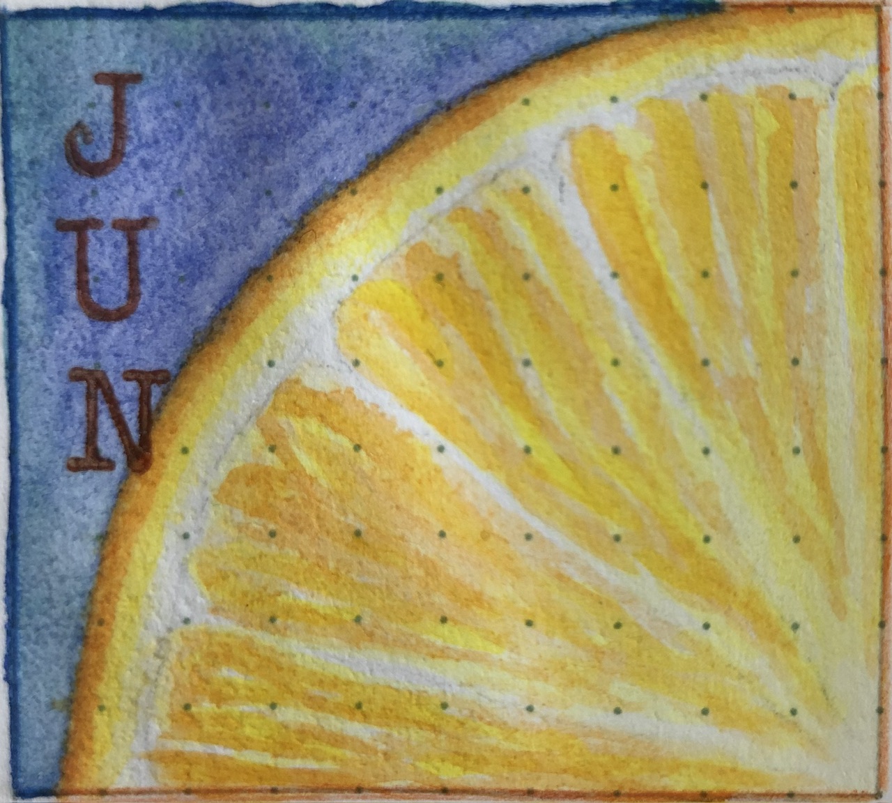
For this month’s cover page I made a so-called ‘Dutch door’, named after a type of door which allows opening only the top half, independently from the bottom half. I’ve seen some very fancy examples, but I wanted to keep it simple and so I chose to just paint a slice of orange, with a backsplash of colourful paints on the underlying page that remind me of juice.
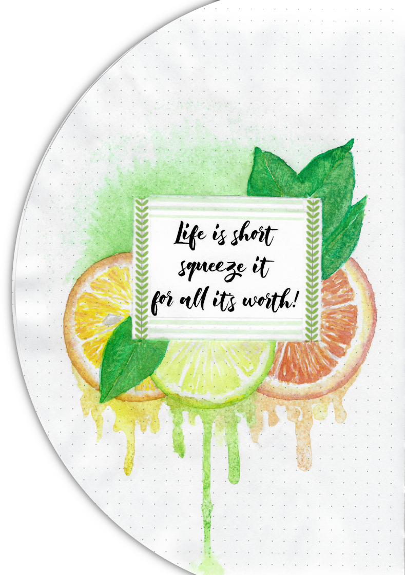
The opposite side of the title page was a perfect space to create a quote page. The font I used this month is called ‘Born Pacific‘ and instead of trying to emulate it, I chose to print out my text and paste it into my journal.
Life is short, squeeze it for all it’s worth!
This month I’m trying out a new resource to help me paint with watercolour in my journal. I’m priming each area with a transparent ground by Daniel Smith, which allows me to use a lot more water to make the colours flow better.
If you’ve ever painted with the wet-on-wet technique, you’ll know how wonderful it is to watch the colours bloom from your brush as soon as it touches the damp watercolour paper. My journal’s paper, while relatively thick, does not allow for that technique, but after grounding it is a lot more forgiving! Nothing beats 100% cotton watercolour paper (cold pressed is my favourite), but I’m very pleased with what I can achieve this way in my journal.
Compact
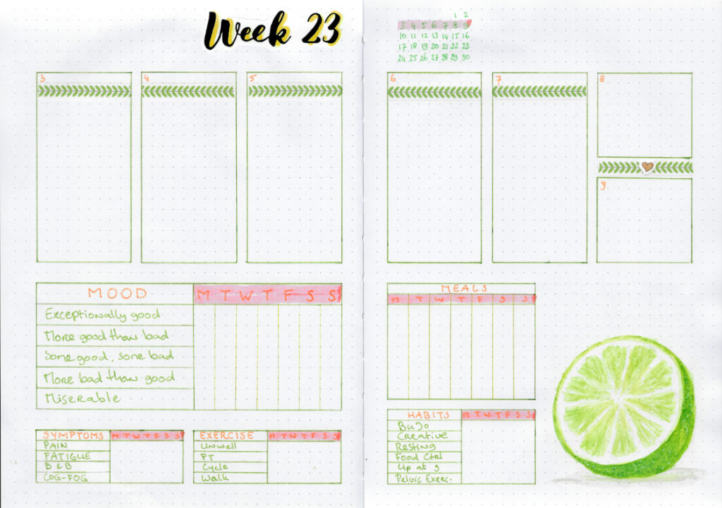
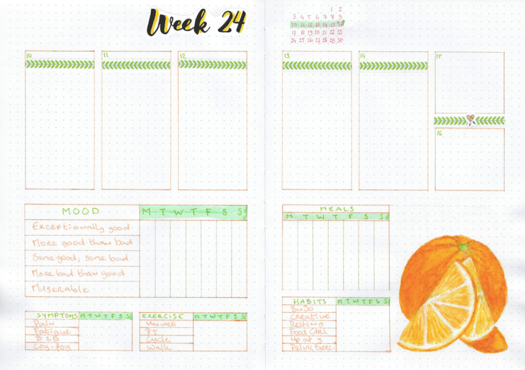
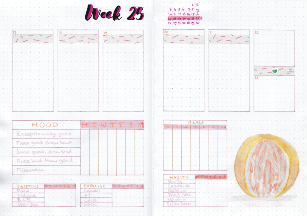
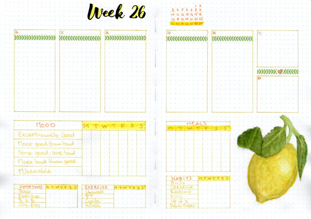
I wanted to see whether I could figure out a more compact way to keep track of all the data I collect each month. The trackers I make usually take up a whole page and it was a fun challenge trying to get them all to fit under my dailies.
While I think it was successful, I did find that I lacked space for a legend for more nuanced tracking, such as the severity of my symptoms. There also isn’t a lot of space left for listing my goals this month.
So while I may try to compact my data again in future months, I think that squishing it all together like I did in June will not become my new default layout. Still, I found space to create a unique little painting on each spread that I’m pleased with, as shown in the image slideshow below.