Traditionally most journalers choose some kind of Halloween theme for October. Since that holiday is generally not celebrated in my neck of the woods, I don’t like following that trend. Last year I went with an Artober theme instead.
This year I’m preparing to travel to Germany, where I will help organise a Halloween themed party during my stay. So for once, I feel connected with that holiday and have chosen to go with a witchy theme to honour the spooky season. 👻
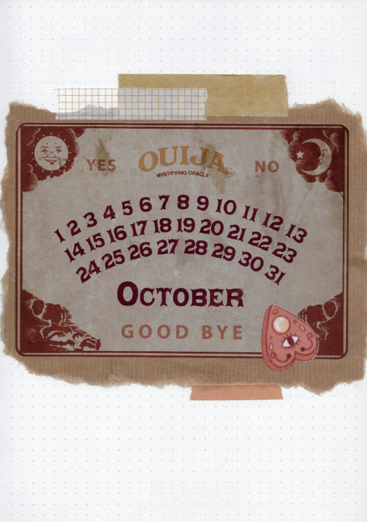
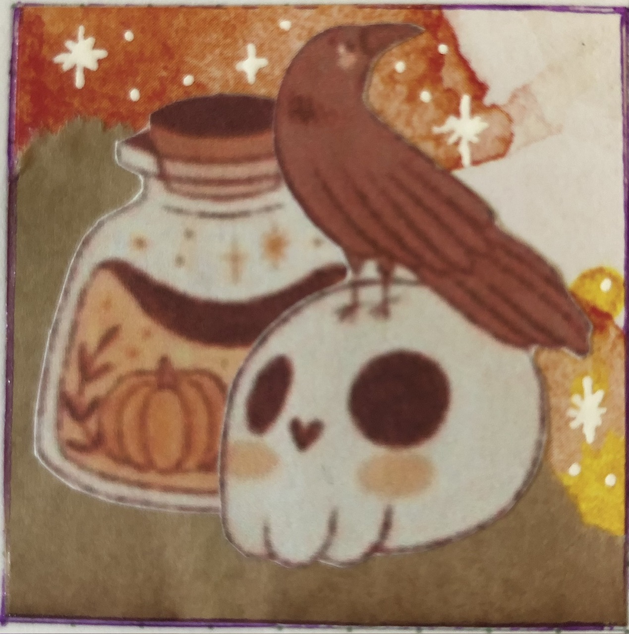
For this month’s cover page I created an altered image of a traditional ouija board, inspired by the sticker of a planchette that was a part of the art I used for this theme, made by Marigona Suli. The font I used here is called Daisy Font, for the tabs and titles in this theme I used the Hidden Archives Font.
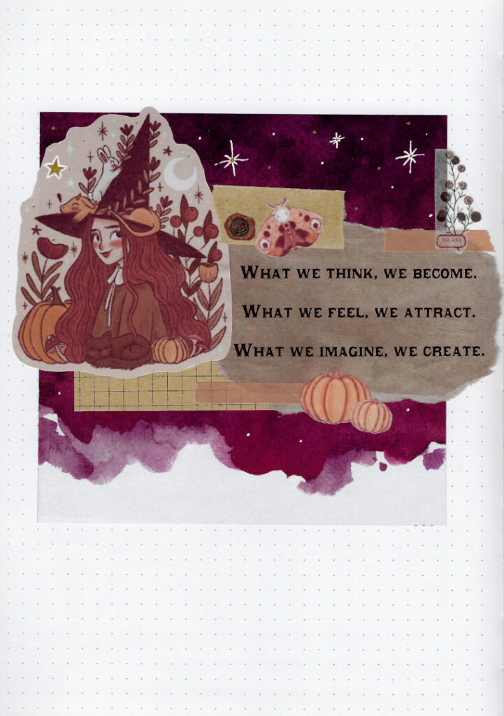
What we think, we become
What we feel, we attract
What we imagine, we create
I found this quote by searching for spells, but apparently it is also sometimes attributed to Buddha. Whenever I quote something, I try to attribute it correctly, which sometimes sends me down a rabbit hole. This time someone else has done that for me and found that it is most likely something that one Adèle Basheer came up with for her online shop Intrinsic. I have not been able to confirm that, as the source that’s linked no longer exists, but here we are.
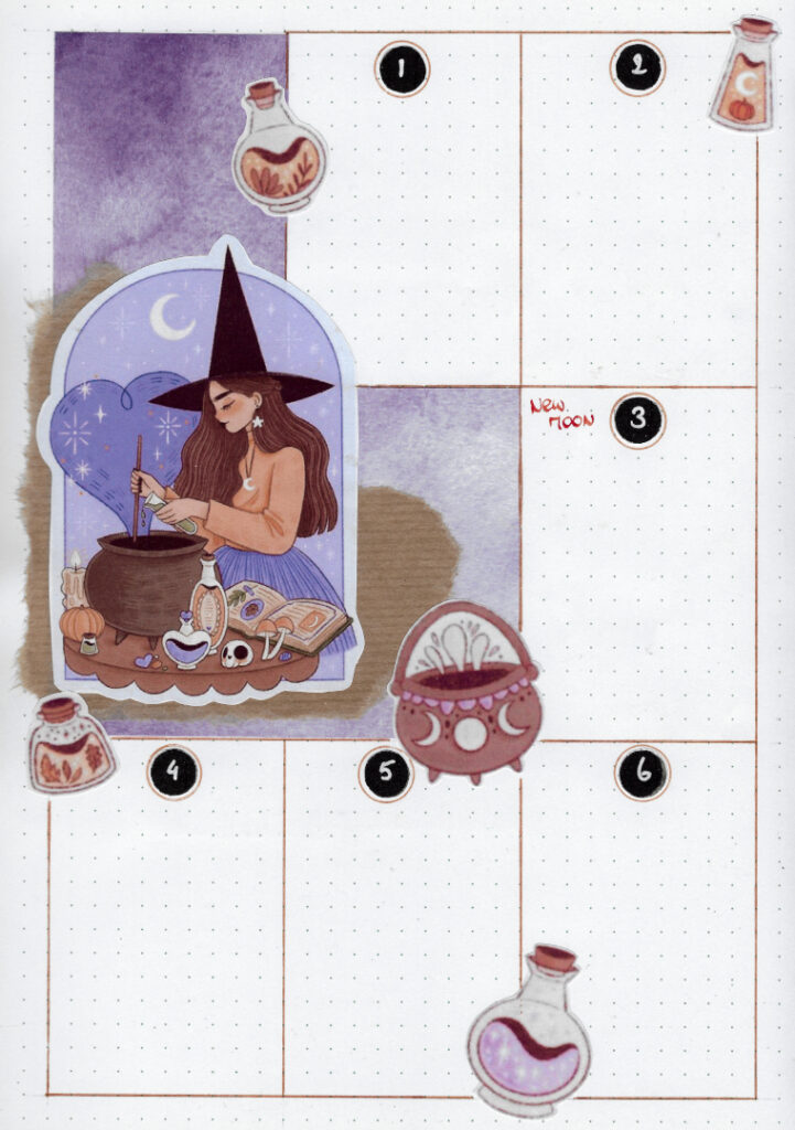
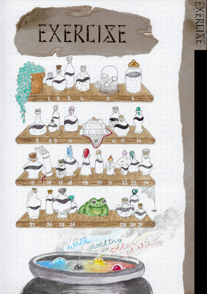
Considering my travel plans during October and November, I have had to create two themes in preparation. I use a lot of resources while I plan and create, so I wanted to have them done before leaving.
When I came up with the witchy theme, I decided that I wanted to use stickers to avoid having to put in too much work. That… did not work out the way I thought it would. This may have become one of the most elaborate themes I’ve ever done. I ended up creating a lot of original decorations and materials, such as the watercolour painting of the potion-laden planks and cauldron for my exercise tracker.
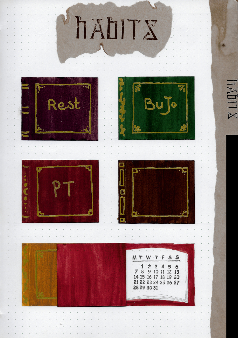
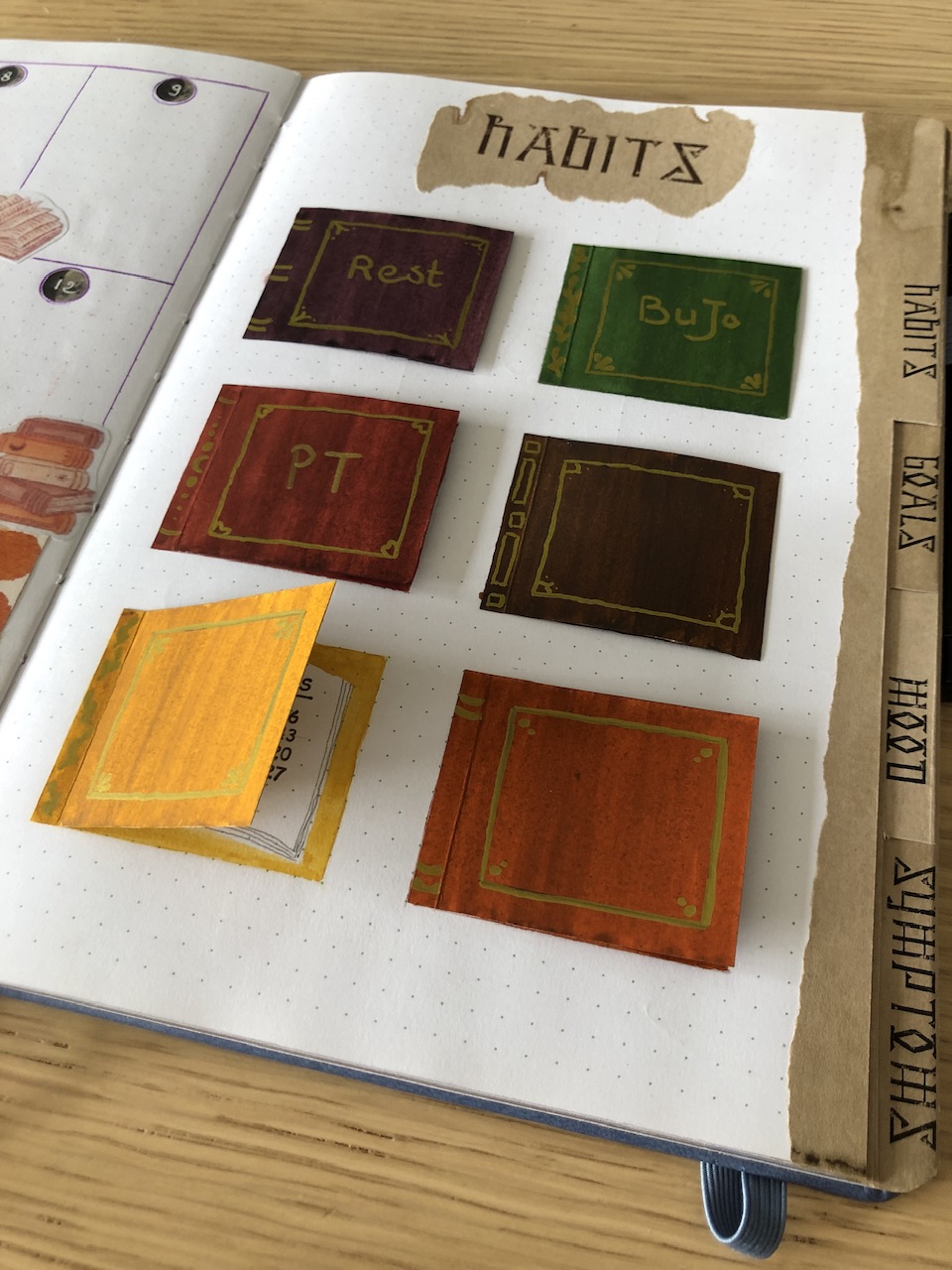
I don’t think that the scan of my habits tracker page does it justice. It does not show the subtleties well and has no depth to it. So I’ve decided to include a photograph of the page as well, which gives a more accurate representation of these cute little spell books, handmade and used to contain the calendars with which to track my habits. I’d be curious to know what you think, so leave a comment below to let me know!
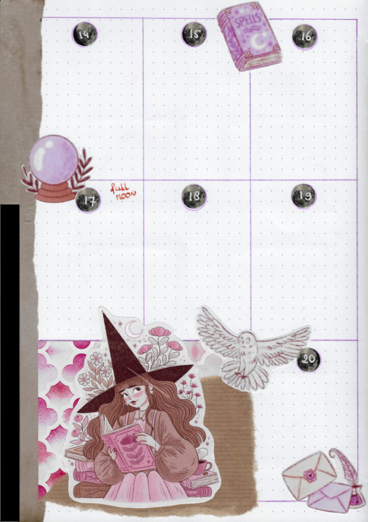
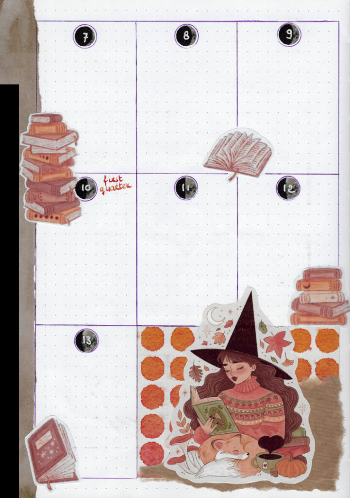
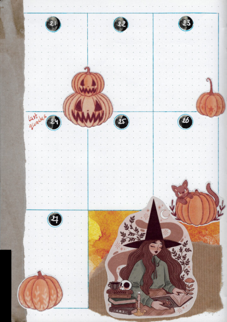
By now you have probably noticed the little moons included on my weekly pages for each day. They are actual representations of the moon phases of each day of the month. I thought that was a cute witchy/wiccan reference to reality.
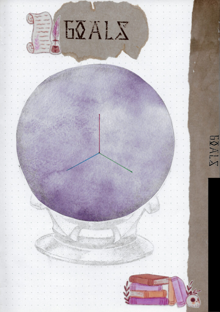
The crystal ball on the page with my goals (to be added later) and health triangle is a custom crafted ‘stamp’. I printed the image on waxed paper, which does not hold the ink well, then overlayed it on some patterned paper stuck to the page in advance and rubbed the ink off on it. I guess I could have added some colour afterwards but I kind of love how it looks, so I decided not to.
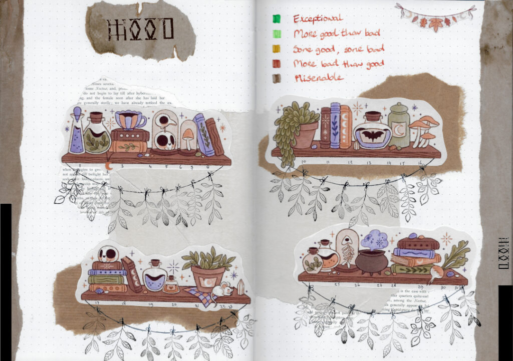
My mood tracker this month is a collage of stickers, paper and leafy stamps. It represents drying herbs and I can’t wait to see how it’ll look after I filled them all out!
The paper used for the tabs and the page titles is custom made ‘aged’ printer paper. I have finally perfected the process and am excited to share it!
Make a concoction of equal parts vinegar, coffee and water, then evenly spray a single sheet of paper with it and dry that in an oven set to ~100°C (or ~210°F) for a few minutes. It goes very fast, do not leave the paper in the oven unattended or you’ll risk causing a fire! Please take precautions for the safety of yourself, your pets and loved ones in the house.
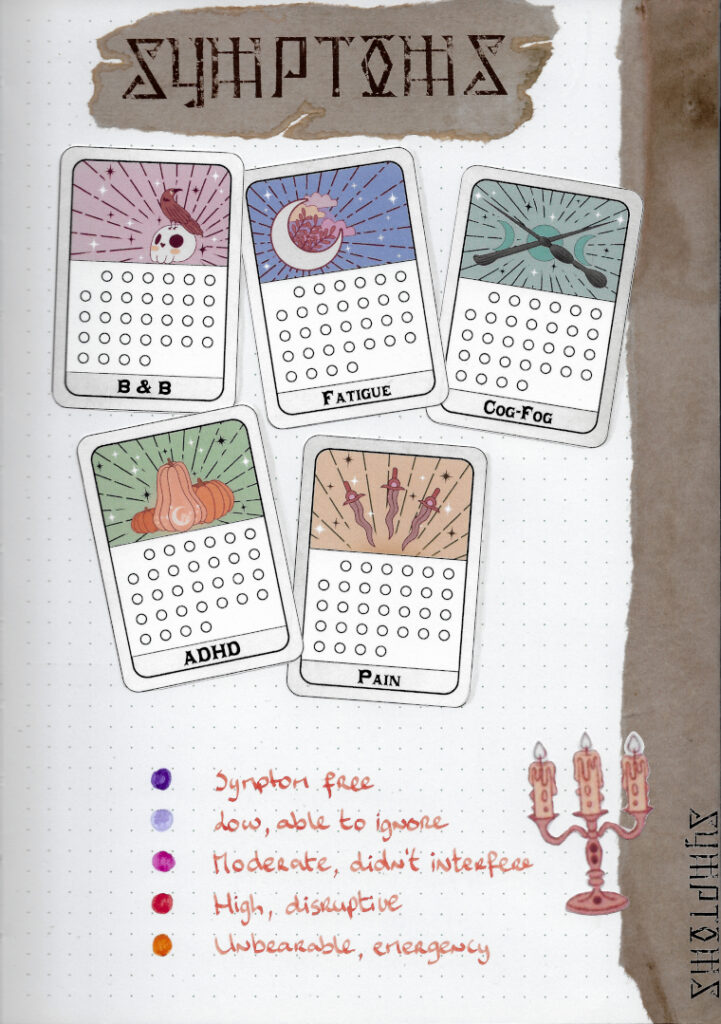
My symptoms tracker is what soaked up the most of my time this month. I created custom tarot cards by recreating some Marigona Suli decorations and adding them on cards that I designed from scratch in Inkscape. I really adore how they came out and I think it will be a joy to fill them out each day!
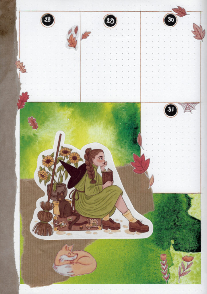
The patterned paper you’ve been seeing on each weekly page is from a little book of watercolour pattern origami papers I found in a local store. You’ll be seeing it a lot more, I really love the possibilities it opens up for me!
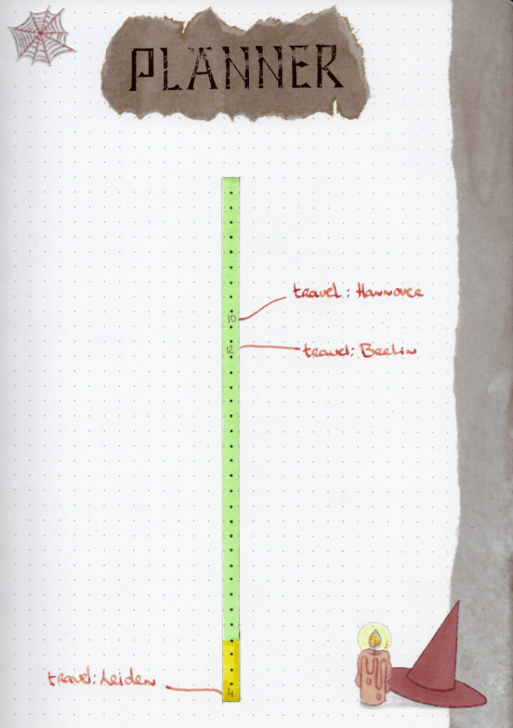
Unlike in other months, this month contains a planner page on which I can take quick notes to see my plans. Since I’ll be traveling and planning activities, I thought it would be a helpful addition this month, since I’ll be using my journal daily and may not use my digital calendar as frequently.
I’m really happy with this theme and proud of how it came out. I’d love to hear what you think! I don’t really get any comments on this blog and I would love a little more interaction, so if you have a moment to share your thoughts below it would mean a lot to me. Thanks for looking, see you next month!
Lisa
This is such an amazing theme! Really a creative spin on the witchy vibes. Love the techniques you used with the spellbooks and the tarotcards for your symptom tracker. Great job!
Lisa
Thank you! I really appreciate your comment. ^^